← Back to work
Case study 01 · Google · Accessibility

Project Relate
Onboarding

Redesigning the first-run experience of a machine-learning communication app for users with atypical speech — closing a 27% abandonment cliff that no one had named.

Project Relate hero
01 — About the app
Why people use Project Relate
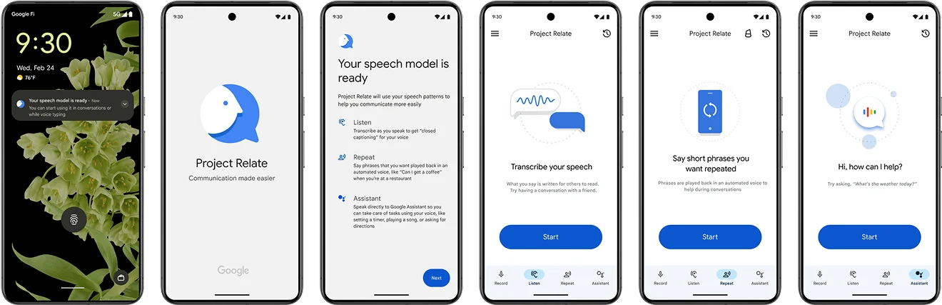
People with atypical speech face real barriers: being misunderstood, struggling with voice recognition, and relying on caregivers to speak for them. Project Relate is a machine-learning app that helps them communicate independently — including with Google Assistant.
Project Relate product context
02 — Problem framing
An engineer-driven beta without the “why”
Relate shipped without strong UX support. Users had to record 500 voice samples before the app paid off — with little explanation of the benefit. Abandonment and weak product-value understanding blocked engagement.
Imagine having to record 500 voice samples without understanding what you get at the end.
How might we improve usability and make the product’s value obvious from the first session?
03 — Workstream
Understanding the speech experience
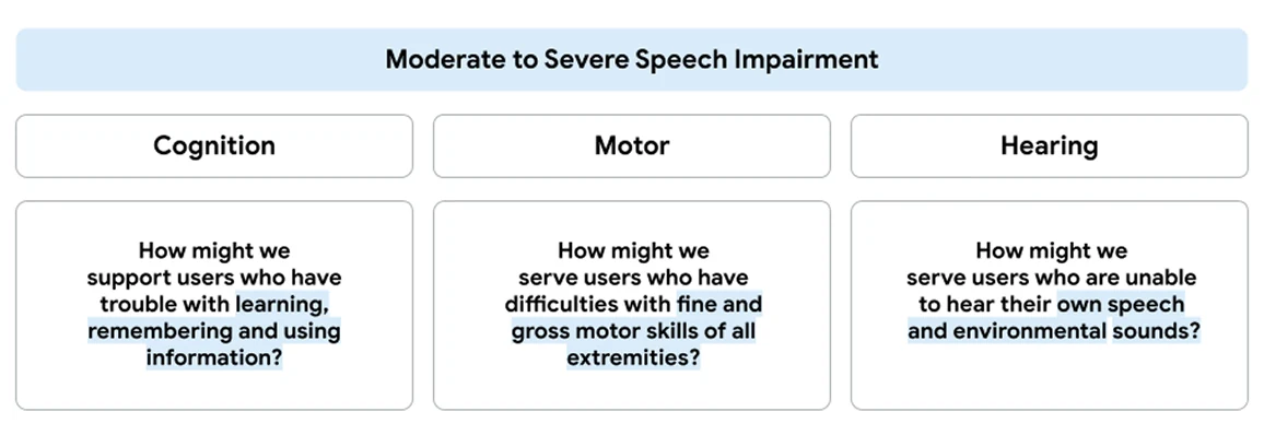
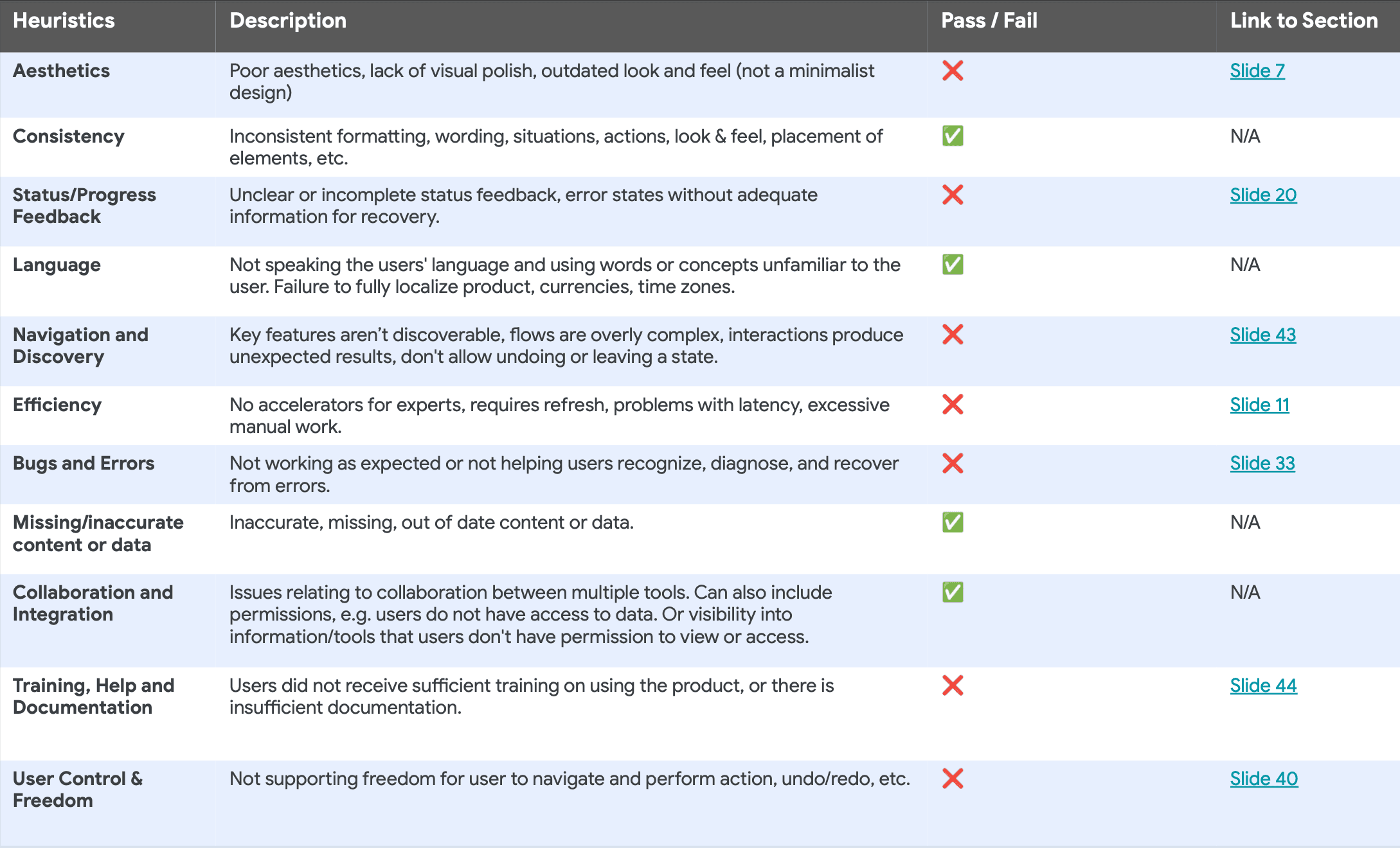
Heuristic evaluation and speech-workstream review made one thing clear: users with the strongest speech difficulties often carry other challenges too. Missing UX support left them guessing.
Heuristic evaluation of Project Relate
Heuristic evaluation — surfacing usability gaps in the speech workstream.
04 — Alignment
User journey workshop
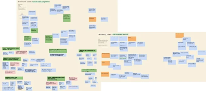
I led a brainstorming journey workshop with the impairment-specific group to unlock needs and align the team on direction before designing solutions.
User journey workshop artifacts
Workshop artifacts — mapping intent, friction, and abandonment moments.
05 — Audit & research
Finding the real friction
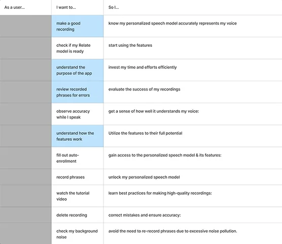
A product audit flagged key improvement areas. A deeper SLP research review — plus collaboration with SLPs and UXRs — confirmed users were confused about features and personalization, not just “unmotivated.”
Usability pain points from product audit
Product audit — key usability fails
User feedback quotes from research
SLP / user feedback synthesis
06 — The cliff
Users were confused — and we were losing them
Funnel data showed the sharpest drop between starting the app and recording something. That cliff became the design problem to solve.
Relate user journey and emotional drop-off map
User journey map — emotional cliff during the 500-phrase recording stage.
07 — Approach
How we addressed the pain points
Four focused moves:
  • Explain product value from the beginning
  • State feature benefits and differences
  • Provide onboarding for recording phrases
  • Re-educate when the personalized model returns
08 — Feature education
From auto-enroll confusion to clear value
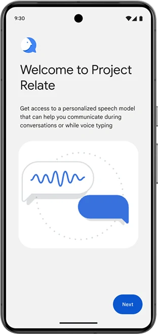
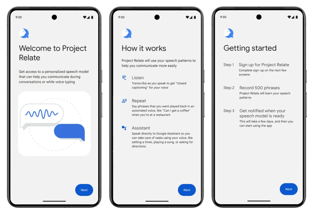
Auto-enrollment skipped explanation. We replaced it with feature education — benefits, differentiation, and personalization — so users knew what they were signing up for before recording.
Previous onboarding screens
Previous screens — app skips explanation.
Previous splash screen
Before — splash with no product value
Previous early access consent screen
Before — dense consent, weak framing
Feature education proposal
Design iteration — feature education
Design iteration proposal screens
Proposed flow
09 — Onboarding
Shaping a step-by-step mental model

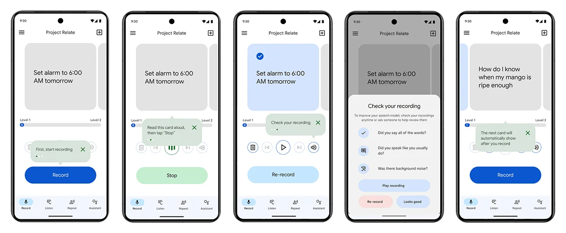
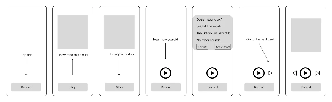
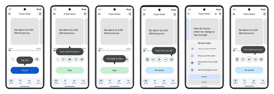
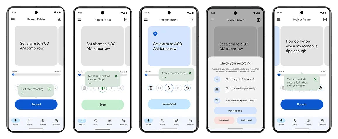
I designed a core product story with a paced recording flow aligned to users’ mental models — clear instructions, tailored for cognitive accessibility.
Onboarding flow iteration
Onboarding iteration — step-by-step recording guidance.
Onboarding screen details
10 — Refinement
Enhancing usability and streamlining flow
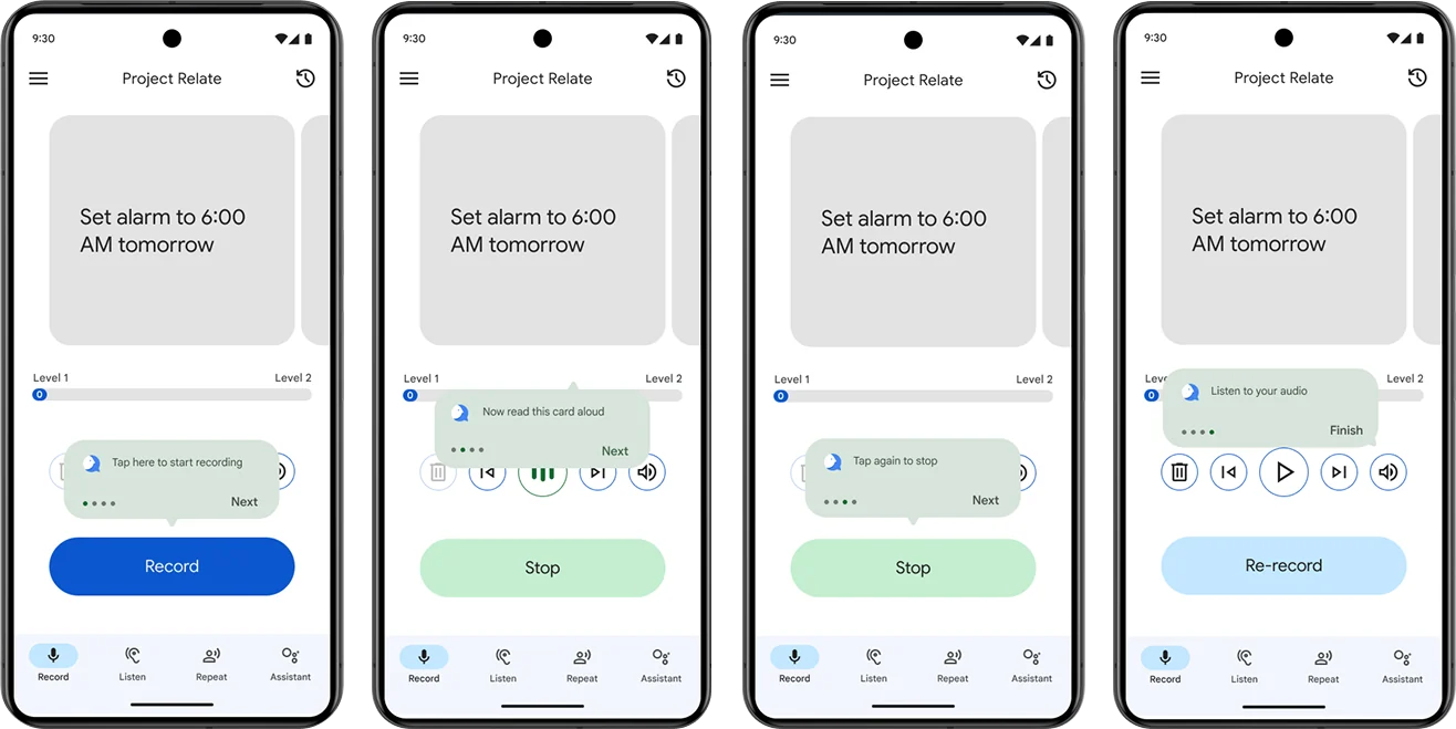
Low-fi wireframes led to team critique and UX-expert review. We integrated research patterns, covered edge cases, and used tooltip guidance + pagination to reduce steps. Collaboration with a UX writer kept instructions concise — including an audio review point after sessions.
Wireframe and usability refinements
Tooltip and pagination refinements
11 — Re-engage
Worth the wait
When the personalized model was ready, a re-education moment closed the training-to-payoff gap — helping users understand and use what they’d built, with wait-time expectations set upfront.
Re-education when personalized model is ready
Re-teach moment — model ready, features reintroduced.
12 — Outcome
Shipped — and highlighted at Google I/O
Internal testing produced consistently positive testimonials. The onboarding redesign was featured in the Accessibility segment of Google I/O (May 2024).
Final onboarding screens
Final high-fidelity onboarding.
Full onboarding flow overview
Full flow overview.
13 — Next & lessons
What follows
Next steps
  • Partner with marketing on a GM3 campaign for new and existing users
  • Run usability testing against the GM2 baseline
Lessons learned
  • State product value early — purpose before effort
  • Design for edge cases and cognitive diversity from the start
  • Keep onboarding step-by-step so users can build a mental model
Next case study · 02
Project Relate
Visual Re-design
Let's work together

Have a problem
worth solving?