01 — Problem & Context
Differentiate in a crowded market
Meal kit services are everywhere — but most feel clinical or logistical, not personal. Market Fresh needed to differentiate by combining recipe curation with ready-to-go meal options, while solving the real friction points users face: dietary restrictions, unpredictable schedules, and distrust of subscription commitments. 53% of surveyed users rarely used meal delivery. 57% had dietary restrictions. Price and time were the two biggest barriers.
02 — Research
Who's actually ordering?
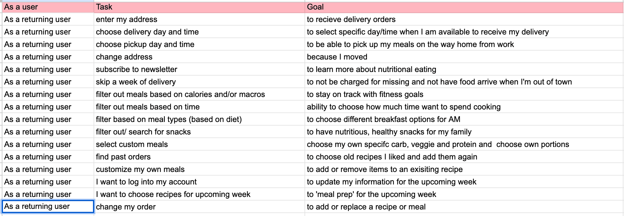
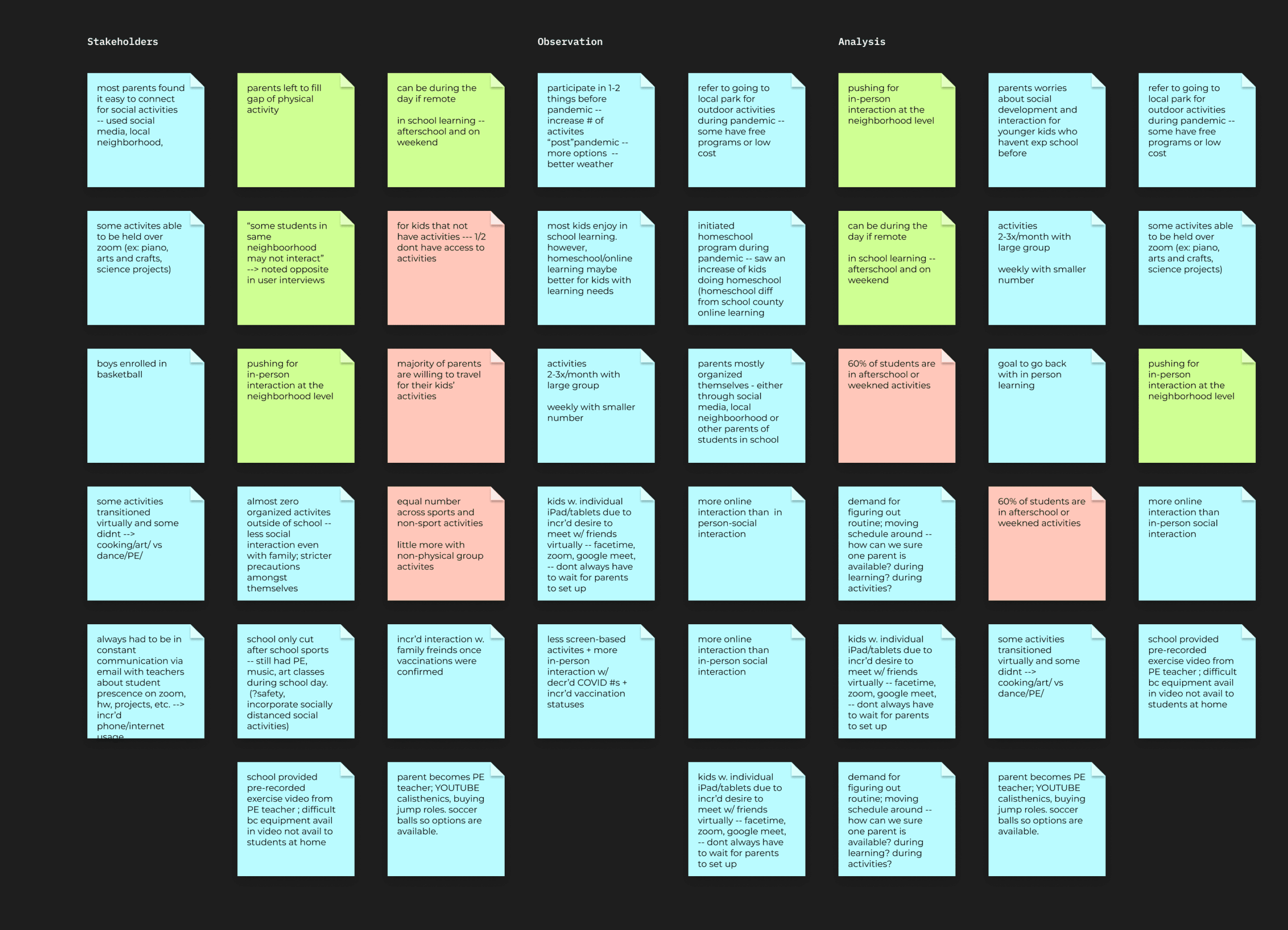
Conducted user surveys and interviews, then built two primary personas to anchor design decisions:
"People expect free shipping, customizable options, and minimal upfront personal information. User trust is crucial — especially when money is involved."
03 — Information Architecture
Story mapping the experience
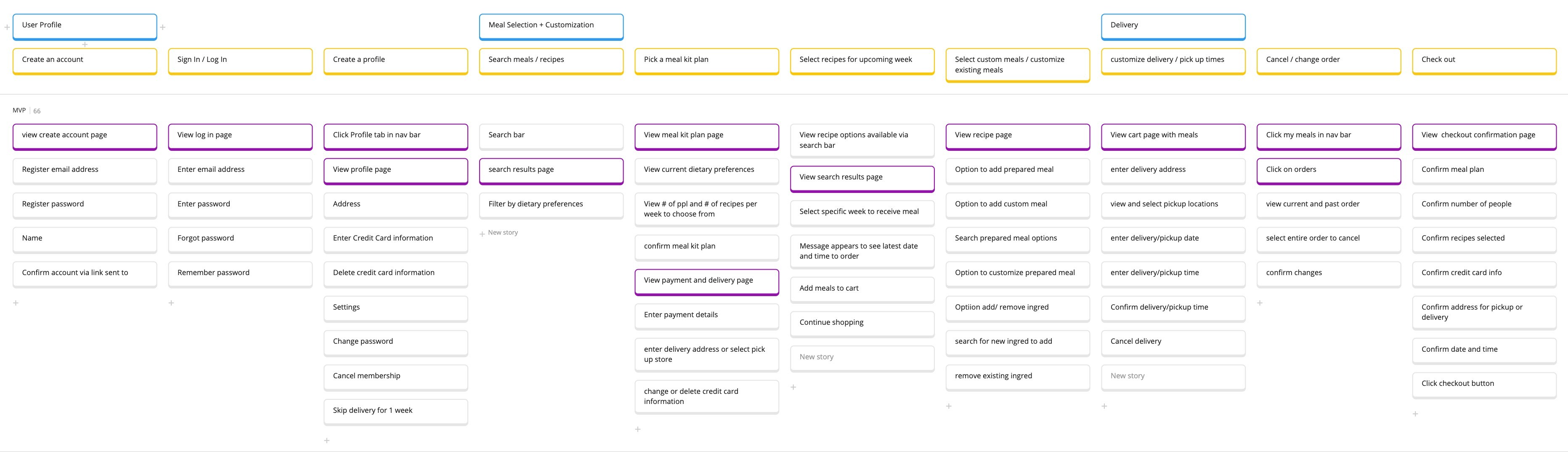
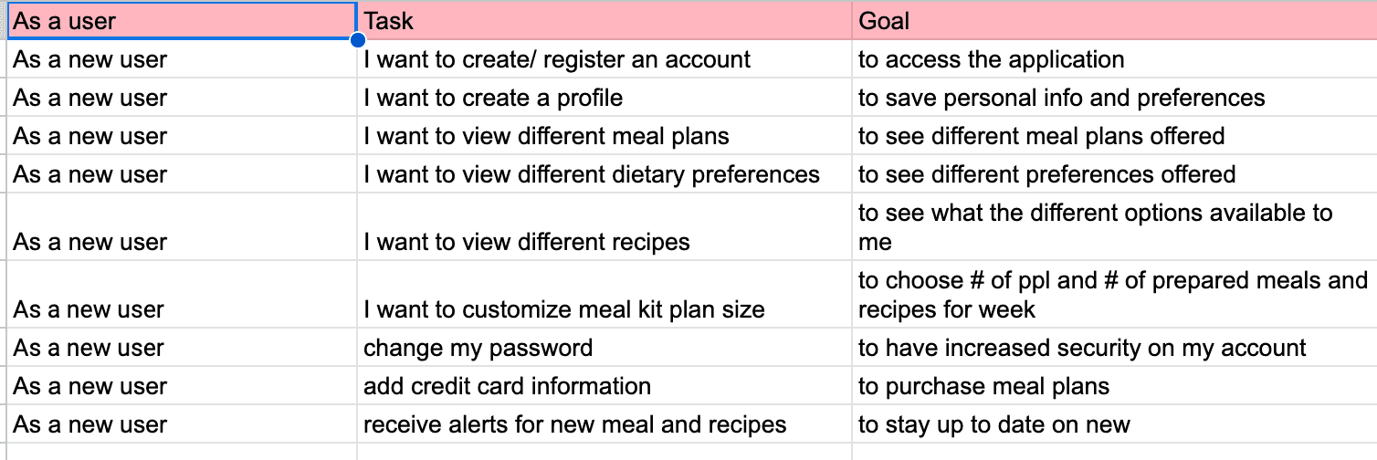
Built a story map covering the full user journey: browse → customize → schedule → checkout → reorder. The key IA decision was separating "prepared meals" from "chef-curated recipe kits" — two distinct mental models that previous iterations had tried to merge, creating confusion for both user types.
04 — Design Iterations
Three options, one winner
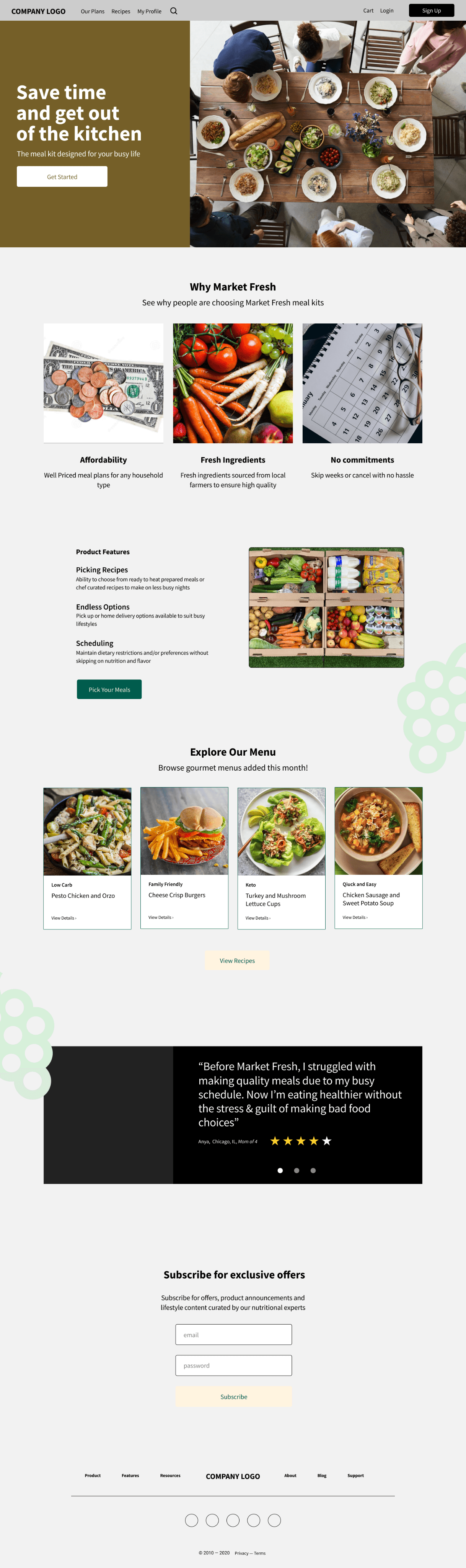
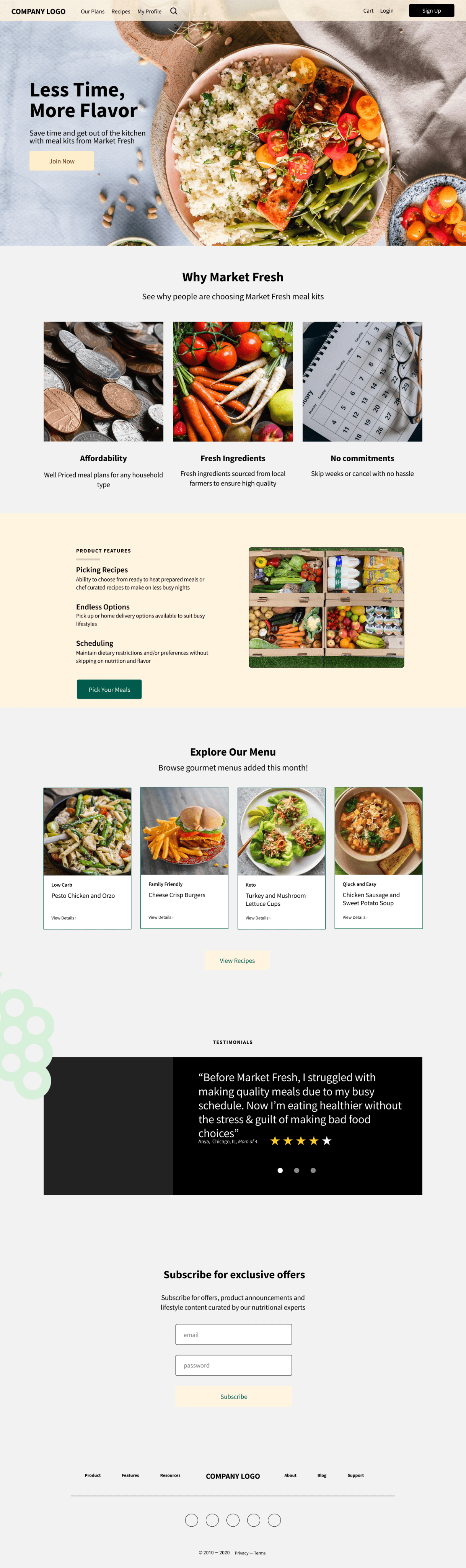
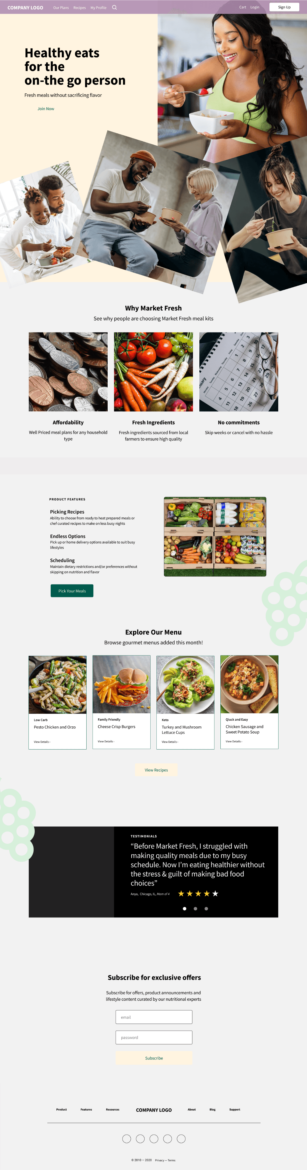
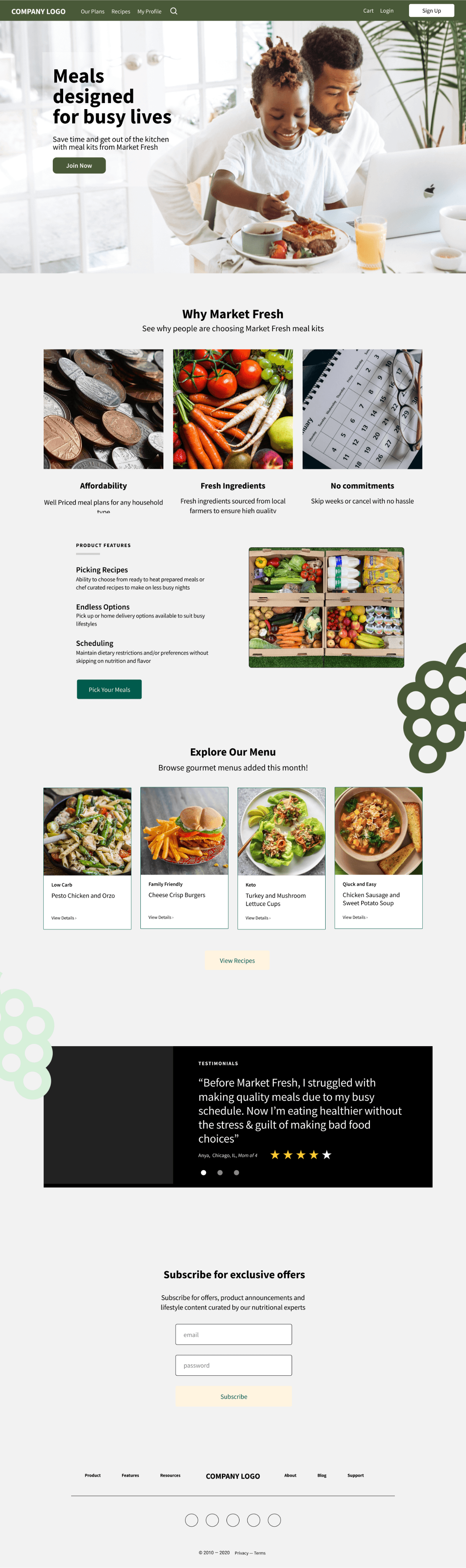
Explored three homepage layout directions (A, B, C) before testing with real users. Option C — discovery-first with a recipe carousel and large dietary filter set at the top — outperformed the others on task completion and perceived trustworthiness.
05 — Visual Design
High fidelity
Warm earth tones and a dark green accent communicate freshness without feeling clinical. Desktop-first layout with generous white space lets food photography lead. A 4px base grid kept spacing consistent across 30+ screens.
06 — Usability Testing
What users changed
Task-based usability testing with 4 participants (2 matching each persona). Key finding: users wanted the freshness window and dietary badge front-loaded on the meal card — not buried in a detail view. Iterated the card component before final handoff. Engagement grew from 10% to 27% after the redesign shipped.
07 — Reflection
Trust is the real product
The biggest design challenge wasn't the IA or the visuals — it was trust. Subscription products fail when users feel locked in. Every decision I made — no mandatory account creation on browse, clear cancellation language upfront, dietary info surfaced early — was a trust decision. When money and food are involved, clarity isn't a nice-to-have. It's the product.